Behind the scenes
New in the online shop: Questions, answers and discussions
by Thierry Pool

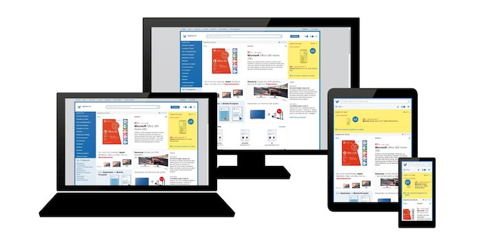
The digitec and Galaxus online shops are now responsive – this means limitless browsing on all devices!
The digitec online shop now provides an optimal viewing experience on all devices – regardless of the type of device you’re using. The displayed content responds to the respective screen size and is always shown in its entirety.
No matter how small your screen, you won’t be missing out on information – that’s including our numerous new Community features. Customer accounts are the same and your shopping cart, shopping list and all saved delivery and payment options work in real-time on all devices.
The complete solution was developed by our very own development department at our headquarters in Zurich West. It allows us to stay flexible and to implement innovations and make improvements according to customer needs.
It’s not just digitec that’s accessible on-the-go but also our online department store Galaxus. And there’s one more change worth mentioning: Our welcome pages now also displays the daily offer of the other shop alongside its own one.
I’m passionate about observing the development of the digital environment – particularly when it comes to the countless exciting and interesting challenges and changes it has in store for our society, our everyday lives and businesses. Apart from that, gaming has been a part of my life since I first started out at Digitec Galaxus as well as IT in general, travelling, sports, concerts and good food.
News about features in our shop, information from marketing and logistics, and much more.
Show all