Six digital painting tips
Nobody is born an expert. If you’re keen to give digital art a go or want to digitalise your current hobby, there are some things to keep in mind.
The first semesters of my bachelor degree course in graphic design were all about colour theory, drawing apples and nude painting. You can only develop an aesthetic sense by understanding the basics. That’s why some of my tips will work just as well for analog art as for digital art.
Even if you’re familiar with colour theory or the proportions of the human body, knowing how to transfer your skills to a digital environment will help you in the long run.
Mastering nature before finding your own style
Observation is key when you’re starting off in the art world. You improve by repeating the same thing over and over, whether you’re working on a computer or tablet. Taking a notebook along wherever you go will allow you to put in spontaneous practice sessions. Draw as much as possible and anything you see.
Remember that digital tools can only take you so far. Develop your analog skills and your digital drawing will improve, too.

If your friends won't do the YMCA, you have to find another way.
Finding your ideal tool
Your choice of a program for digital art is a personal one and it comes down to the tools and effects you want to work with. Many people use Adobe Photoshop and download or create custom brushes.
I prefer working with the brushes that are already there. That’s why Corel Painter has been my program of choice since college. I recently discovered ArtRage and really liked it. If you’re looking for free programs, GIMP or FireAlpaca do the trick.
Go big or go home
Before you start painting, most programs will ask you about the size of your digital canvas. This input is really important – unless you’re planning to do vector artwork. You can always reduce the size of your art, but you can’t increase it without ending up with some distortion.
Always keep your goal in mind: If you’re creating a wallpaper, choose a 3840x2160 canvas, so that it will look good even on a 4K screen. If you’re planning to print your art, the size you choose should be no smaller than the sheet of paper you’re going to print it on. For example, if you’re printing on A4, work on an A3 canvas. This gives you the freedom to change your mind any time or crop some parts off your drawing if you need to.
Colour by numbers
Don’t paint with colours from the very beginning. You first have to learn about lights and shadows and the best way to practise this is by using black and white only.
Once you’ve mastered black and white, start adding more colours to the equation. I recommend using a colour scheme and working from there.

Layer up
Working in a digital environment offers the same advantages no matter which tools and programs you’re using. One of the main advantages is the possibility to work with layers.
Personally, I like to begin with a basic sketch by blue pencil as the lowest layer. In the ancient times of Xerox, artists would use a non-photo blue pencil for the first draft and paint over it with ink. Non-photo blue is a shade that’s barely replicated on film or photocopy, so it doesn’t need to be erased. Today, it’s easy to get rid of the blue strokes by increasing the contrast and brightness on Photoshop (or just erasing the layer).
Let’s get back to the process.
Once I’ve created a decent-looking sketch, I work on the final outline on top of everything. When adding the colours, make sure to be generous with layers between the final and the drafted outline. This allows you to erase or edit parts of your drawing without ruining the whole thing.
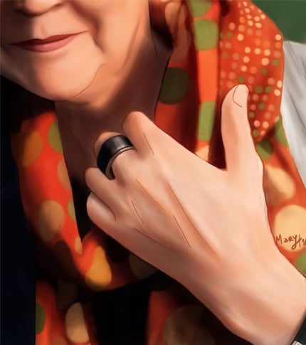
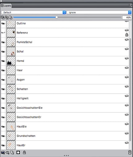
I painted this last year as a Christmas present for my mother-in-law. You can see how many layers it took just to get the skin right.
Photoshop until you drop
We all make mistakes. Admitting to them requires strength. Fixing them requires Photoshop.
In the process of mastering your art, you’ll never get it right at the first attempt. That’s why Photoshop exists. Photoshop is not only handy for photographers, it’s also a great retouching tool for art.
Before I learned about proportions, I had trouble drawing a human who didn’t have a head with the size of a pumpkin. It was only when I finished my drawing that I realised that it looked strange. At this point, you’d think it was too late to make corrections and you’d have to start again from scratch. You don’t; Photoshop is here to save the day.
To change the proportions of the head, use the Pucker tool from the Liquify. If something is in the wrong place, fix it with Forward Warp. For subtle retouching, apply the Smudge tool with a high strength value.
It’s also possible to make colour corrections: You can increase saturation, adjust brightness and contrast or overlay another image to add a little texture.
That’s it. Follow these tips and you’ll create a real masterpiece. Have fun!

Do you have other tips that work for you? Share them in the comment section.
I might be a graphic designer, a Pokémon trainer and tech-savvy but I'm no creative writer. I'm on a non-stop quest against bad design. Since 2014, I call Switzerland my home.
Interesting facts about products, behind-the-scenes looks at manufacturers and deep-dives on interesting people.
Show all