My work is successful when you can’t see it
It’s always tricky to explain to my friends, family members or the odd colleague what it is that I do as an interaction designer. My standard reply is «I design websites» – but that’s only half the truth.
Not only is it half the truth, it doesn’t reflect all the topics me and my colleagues at Digitec Galaxus deal with. Just like sales assistants don’t just sell and carers don’t just look after people, I also do more than just push pixels around a screen. My work is good when it’s not visible to you. Sound strange? Let me explain.
Certain everyday things are amazing. Maybe they just look good or do a unique and great job. You might even have become emotionally attached to them. The term «user experience» defines the overall impression you have when using or interacting with something. This something could be anything. In my line of work «user experience» refers to a technical device, a software or a website.
Each day, we have hundreds of interactions – mostly without noticing them. Like the vacuum cleaner bag that takes three gos until it’s in place. The TV remote with its 127 buttons even though you only ever need four. The software that feels as if it needs an update every seven minutes. Or the fancy Italian coffee maker that produces amazing espresso but requires a full disassembly to be cleaned.

Form follows function. Or does it?
Negative user experiences are frustrating and can lead to aversions to certain things. Positive user experiences, on the other hand, usually go unnoticed. Like a product that requires no manual. Or a website that displays the exact information you were looking for. This much for now: Positive user experiences are no coincidence but the result of an elaborate creative process.
Nowadays, it’s less about just designing the shape of a product and more about the way we use, interact and are emotionally involved with it. Good design serves the purpose of making technology accessible and easy to understand. That’s what we interaction designers do.
The ongoing digitalisation of our environment has made the question of what makes a good product and a good design a lot more complex. After all, an increasing number of digital devices combine various functions. The best example for this is your smartphone: An all-in-one computer, calendar, watch, alarm clock, compass, letterbox and quite possibly even heart rate monitor.
«Interaction designers examine user behaviour and motivation in order to create improved experiences. After all, good products don’t need user manuals.»
Discuss, refine, negotiate – until everything’s right
Both our online shops have undergone significant changes in the last few years and now provide a lot more possibilities than just buying products. You can cancel orders and sell your used products. You can read magazine articles like this one here and have your say in our community.
There are lots of processes running in the background, invisible to the eye, for all this to work. Many specialists – from logistics to software development – are involved so the product you ordered is delivered the following day. Interaction designers make sure these processes are smoothly interlinked. As a customer, you shouldn’t see any of this. It should just work.

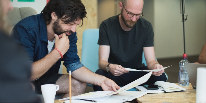
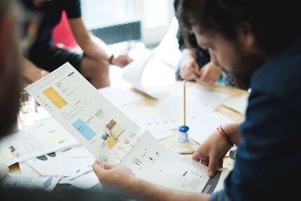
The interaction designers at Digitec Galaxus don’t have their own team. Instead, we’re all part of various development teams where people with different professions work on the same issue. Team «Rocket» has ten members and deals with topics concerning the community, among other things. Backend engineers, frontend engineers, business analysts, product owners and interaction designers together improve existing functions or implement new ideas. These experts all contribute towards an ideal solution.
While interaction designers mainly focus on user needs, there are also corporate and technological factors to consider. Finding the balance between the three poles is not always easy. It involves a lot of discussing, convincing and communicating. Sometimes it also means letting go of an idea.
We clear the path
Of course, we interaction designers also exchange ideas: We do that in our guild where we learn from each other’s experiences. The guild is also where we reach a common understanding of our mission and where we strengthen our general strategy to cater for customers by means of understanding and sensitivity.
In other words, our personal attitudes, preferences and opinions take a backseat. The customer is at the heart of everything we do. At which point does a customer need certain information to make a purchase? When do customers want inspiration, motivation, reassurance or confirmation? This is a big challenge. After all, there is not a uniform customer. Personally, I think we’re lucky to have such a diverse bunch of customers. Granted, it doesn’t make my work easy but all the more interesting.
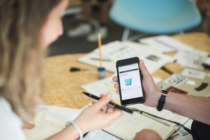
Our work is based on the data regarding where and how customers use our website. We collect as much feedback as possible and evaluate the shop data. In addition, we speak to our customer service team to find out about the most frequent queries and problems. Occasionally, we invite customers to interviews and try out new ideas with them.
Two ideas we’re working on
We recently tested a new feature on the product pages of our online shops with some of our customers. Now, the feature is available to everybody: Maybe you’ve noticed the small block containing product information. It appears whenever you scroll down on a product page.
Why are we doing this? Our research has shown that many users who are interested in a certain product have several open windows in their browser – usually from various providers. If you’re looking at products that are similar, like mobile phones or notebooks, it’s easy to get lost. Which browser tab am I in? Which product was that again?
Thanks to the compact bar that’s glued to the top of the product site, you won’t get lost, even if you’re deep in the specifications of a product. The block serves as a bookmark when you’re beating your way through the shopping jungle. It’s still unclear if this feature will be permanently integrated in the shop. The evaluations are ongoing.

Another example is the improved search function and the search result page. We know that the search feature is an important entry point for many users. What’s more, with our constantly growing range, it is becoming increasingly important. In the last few months, we’ve been working hard to improve our search experience. Visually, we’ve simplified and enlarged the search field.
For several weeks now, you can see at a glance if a product, an article, a community post or a help page corresponds to your search term. Another new feature is correction suggestions for typos. In addition, we’ve completely restructured the search result site.
These modifications were all preceded by a research phase: We analysed search queries and tested our ideas with real users. This allowed us to significantly improve our search feature in terms of its look and content. Today, our search function is not only faster but smarter. But it still has a lot to learn.
Want to help us?
We’re always looking for users who are interested in helping us improve our shop. Maybe this article inspired you to take part in one of our user studies or interviews and to test new ideas for Switzerland’s largest online shop? If it did, simply register via the below link. We’re looking for everything from hardcore shopper to digital newcomer.
Sign up for a user study now (currently only in German)
I like to create things that are fun to use and fix broken systems through design.
News about features in our shop, information from marketing and logistics, and much more.
Show all