Microsoft 365 apps get new icons
Microsoft is refreshing its Office icons. Word, Excel, PowerPoint and Co. now look different - more curvy, more colourful, more true to the system. The new design follows Fluent principles and is intended to bring clarity.
Since the last major redesign in 2018, little has changed with Microsoft's Office icons. Now comes the next step: the new icons are part of a larger UI refresh that is based on Microsoft's Fluent design language and the Copilot integration. The aim: less visual baggage, more clarity and a look that feels consistent across desktop, web and mobile.

Source: Microsoft
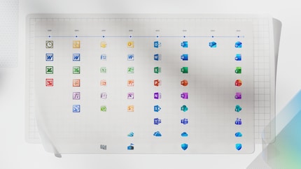
Microsoft has published a timeline showing the visual development of Office icons back to 2001. Back then, angular shapes, bold colours and lots of volume dominated. Since then, the design has changed several times - from blocky icons to flat colour areas and the new, curvy shapes.

Source: Microsoft
The first leaks appeared as early as spring 2025 - including on Reddit and in internal builds. The icons were already visible, albeit not finalised.
Curves instead of edges
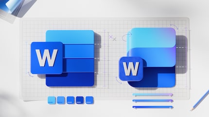
The new icons are no longer angular and static, but soft and moving. Microsoft speaks of «fluid forms» and «vibrant colours». Word remains blue, Excel green, but the shapes fold, bend and appear more accessible. The design should not only be pretty, but also separate functionally: What belongs together? What is independent?

Source: Microsoft
Copilot as a design player
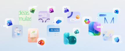
The new look is not just cosmetically motivated. Microsoft also wants to emphasise the role of AI in everyday life with the refresh. Copilot is now deeply integrated into Office and the design should reflect this new way of working. The icons are therefore not just icons, but visual brands for a changed software logic.
Already visible - but not everywhere
The new icons are already appearing in Word, Excel and PowerPoint, but not everywhere. Depending on the app, region and update channel, many users are still seeing the old design. Microsoft is rolling out the changes in phases - across web, desktop and mobile.

Source: Microsoft
I find my muse in everything. When I don’t, I draw inspiration from daydreaming. After all, if you dream, you don’t sleep through life.
From the latest iPhone to the return of 80s fashion. The editorial team will help you make sense of it all.
Show all