Product test
Huawei P30 Pro: perfection of a platform
by Dominik Bärlocher

Huawei’s user interface, Emui, has lots of new tricks up its sleeve. Perhaps it’s time for me to give up the fight against the worst user interface on the most tech-forward phone.
For months now, Huawei has been promising to update to Android 10. It could be the company’s last Android update, as trade relations with the US are tricky to say the least. Since May 2019, American companies haven’t been allowed to trade with Huawei after President Trump’s administration put Huawei on the trade blacklist.
And what did one of Google’s most important partners do with the operating system? Ever since the start of smartphone development, Huawei opted for its own user interface, which is now known as Emui. I’ve been fighting a battle against Emui for the last two versions at least – in other words, since Emui 8. Don’t get me wrong, the Huawei hardware is always great and rarely outdone. But Emui itself is absolutely rubbish. The fonts are ugly; the user interface is barely acceptable and some changes are so nonsensical you’d think they’d only been made just because someone at Huawei could.
That being said… if a new iPhone is out of your price range and Android is too nasty for you, it’s worth taking a look at Huawei’s Emui. In terms of the default controls and general look and feel, it’s fairly close to Apple’s iOS.
First off, Huawei promises too much. Emui 10 might be a solid effort but it’s not the second coming of the smartphone operating system messiah that’s hinted at. Meanwhile, the update to the beta version of the software is surprisingly small, especially when you consider that Huawei’s security updates are usually huge for some mysterious reason.

If you used Nova Launcher or another third party launcher before the update, this preference will be amended. Until the redefining of Nova Launcher as standard, you at least have the Emui Launcher. Now Huawei, I understand that you want me to see the new things you’ve created, but I decided I wasn’t a fan of your software many moons ago. So I don’t mind seeing the new elements – just as long as you respect my decision.
But the first thing I notice is that the animations on the controls go a bit quicker. Very nice. I mean, let’s face it, slow animations – even if it’s only a matter of a few tenths of a second – take time and waste it unnecessarily. It also has the added positive effect of making it seem like your phone is working faster. Objectively, that’s obviously nonsense but in terms of use, it’s a welcome, refreshing touch.
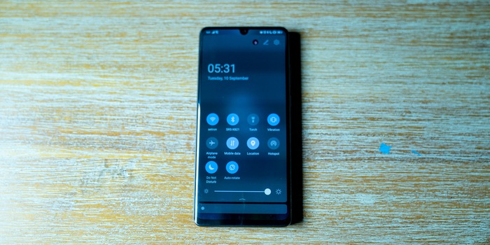
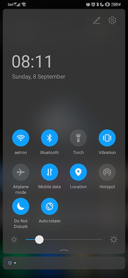
Then there’s the navigation tray that you pull down from top to bottom. Huawei enclosed the icons in the navigation tray in a circle, which turns blue in dark mode when they’re active and grey when they’re not. It looks like the Samsungs One UI.
The similarities with Samsung can’t be missed once you swipe the tray down and let the toggle switches take over the whole screen. When the tray is down, the switches slide to the bottom end of the screen, which makes use with one hand a lot easier.
There have also been a lot of changes in the device’s settings. Huawei adopted the circles around the settings from Stock Android, the pure version of Android. This makes the menu seem more spacious and relaxed thanks to more negative space. Nice one.

If you normally use a launcher such as Nova Launcher or Lightning Launcher then expect some changes. But otherwise, everything on the Huawei phone is as it was.
The Italian painter Giorgio Morandi Pate represents the colour scheme. Well, not personally as he died in 1964 but his work does at least. Morandi was known for painting everyday objects in subtle pastel colours. His understanding of visual understatements was so sophisticated that even black would have been too stark an accent in his work.

Huawei has taken inspiration from this and developed the Morandi Colour System. When it comes to dark mode, that might sound a bit of a strange concept given that it’s traditionally based on a black design. But Huawei was inspired by Morandi rather than just adapting or imitating it and that’s why it works.

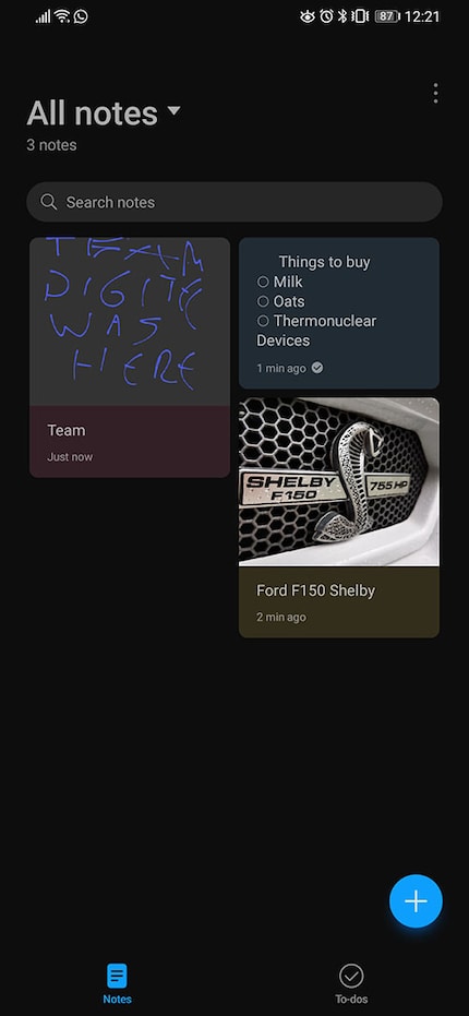
Morandi style isn’t just about colours. It also brings a certain amount of ease and space. The white space – sometimes black – looks impressive and incredibly like Apple. As for Huawei’s own apps, the Apple influence is even more stark – with a hint of Google Keep, for example in the notes app.


Incidentally, writing notes with your finger on all three of these apps is a disaster but a funny one. The notes you end up with might not be efficient or legible but at least it could double as some kind of party game along the lines of «whoever can decipher the word I write can sit out the next round».
And here we are, time for a quick verdict. There’s not much left of the old Emui versions. The software I’ve fought so hard against is barely recognisable. Nova is still used in operating the home screen and the app drawers but the dialogue and general Emui feeling is gone.
Right, I’m off to try and replace the Emui 10 font. I don’t think the old hack works anymore.
Journalist. Author. Hacker. A storyteller searching for boundaries, secrets and taboos – putting the world to paper. Not because I can but because I can’t not.