Do you like the new Office icons?
- Oh yes, the new icons are beautiful.73%
- I like the previous icons better.9%
- I don't care about icons, as long as the programs work as desired.19%
The competition has ended.

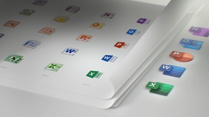
Design adjustments are always a tricky business, especially as people are generally reluctant to part with the familiar. But Microsoft has obviously not fallen on its head and has chosen a clever solution for the new Office icons.
After the introduction of the new Office products at the beginning of October, new icons in Fluent style are now following. These will be distributed to users over the coming months by means of updates. Microsoft's new livery is intended to be bolder, brighter and friendlier. This is what Jon Friedman, the head of Microsoft's Office design, writes in a blog.
It's not easy to give yourself a new look without running the risk of offending users. Even though Microsoft has skilfully separated the letter from the symbol in the new icon design, thereby brightening up the entire Office palette, the question remains as to how users will react to this change. Will grandma and granddad still be able to find the right button to start Word or Excel in future?
In the past 15 years, Microsoft has updated the icons every three to four years. So it was high time to finally set an example after five years. According to Microsoft, the new icons should reflect the simplicity and performance of the Office range. I think that although these buzzwords are marketing blah-blah, they actually apply quite well to the new icons.

The new icons are available for all devices and platforms. Whether Android, iOS, macOS or Windows - you as a customer will always see the same thing, whether in "Office 365" or "Microsoft Office Online". These new features are just one part of a larger-scale modernisation that also affects the ribbon ribbon, among other things. Subtle colour changes add the finishing touches to the Office menu bar, which has been thinned out to make it easier to use.
By the way, Jon Friedman has already hinted that this is just the beginning of a large-scale renewal offensive. It seems that the coming year will also bring new Windows 10 icons.
What do you think - will Microsoft manage to realise the desired marketing message of seamless connectivity, simplicity and harmony with the new icons?
Do you like the new Office icons?
The competition has ended.
I find my muse in everything. When I don’t, I draw inspiration from daydreaming. After all, if you dream, you don’t sleep through life.
From the latest iPhone to the return of 80s fashion. The editorial team will help you make sense of it all.
Show all