Blind to it: opening our eyes to the blind community
We've known for a while that our website isn't accessible for some disabled people. But watching a blind person trying out our shop really opened our eyes.
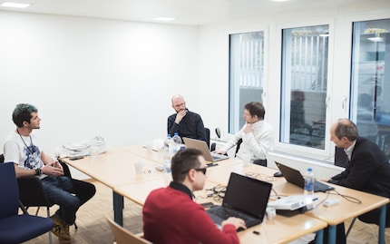
Our website doesn't fare well in terms of accessibility. In fact, we came out the hardest to use in a group of online shops that were all pretty unfriendly to disabled users. This was according to the Swiss foundation «Access for all» in their 2016 accessibility study (available in French and German). Fast-forward to 2018 and we're sitting in the foundation's offices to find out what's so bad about our website and how we can make it more accessible for all users. Incidentally, when I say «we», I mean UX designer Stefan Jost, front-end developer Remo Vetere, photographer Thomas Kunz and myself.
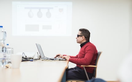
Gianfranco Giudice, who is blind himself, is testing websites for the foundation according to how easy they are for disabled people to use. Now he's sat at his laptop browsing digitec.ch. He has a special type of software called a screenreader that reads out what is on each website page. But what the screenreader says isn't helpful. The reason being there is additional information missing from the site that the reader needs in order to properly explain the images.

Where blind people struggle
Sighted people recognise a navigation menu purely on the basis that it looks like one. It's also in a place where they'd expect to find a menu. But for a screenreader to detect it, the navigation has to be marked in the site's source code. Otherwise the voice output just babbles on and the blind person has to figure out for themselves this is probably a menu.
And that's exactly what happens with our website. Ideally, the screenreader would read out a heading, which gave a summary of the page and then announce the menu. On digitec.ch it just launches straight into a six-point list: contact, help, about, locations, social media, jobs. The device reads it out at the pace of a high-speed train and it mangles English words by pronouncing them as though they were German. Despite it all, Gianfranco manages to find his way through it just fine. His ears are used to it. The issue he has is in finding his way around.

Gianfranco works out that the six-element list must be a navigation. But then listed on the top right are the words «German» and «Incl. VAT». At that point it's not self-explanatory what that bit is – especially as the screenreader doesn't make it clear each of these have submenus. Sighted users will spot the little arrow pointing downwards. But this graphic is obviously of no use to Gianfranco.
The nightmare of registering
And so it continues. Even the column menu doesn't have a title. And the posts start with an image that doesn't come with a text explanation (the alt attribute in HTML). Then there are two category tags and only after that is the title read out. According to Gianfranco, it would make more sense to have the title come first in the source code and then have the sub elements follow. Of course, this could follow a different pattern in terms of graphics and how it's laid out visually. In web design, visual structure and logical structure can be separated.
Gianfranco now tries to register. The screenreader doesn't give the descriptions of the form fields, such as «first name» and «last name». Gianfranco doesn't know what he has to input where. It only starts to read things out once it gets to the phone number section further down.
But it throws a spanner in the works again when it reads out the Facebook symbol link as just «link». Hmm... We had to laugh but we were both embarrassed. However, now we know why the website scored so badly.

Different disabilities have different needs
The purpose of this meeting is also to educate ourselves and exchange ideas. That's why photographer Thomas Kunz and I also have the UX designer Stefan Jost and front-end developer Remo Vetere with us. Before we begin, Andreas Uebelbacher from the foundation gives us some background information about the charity and their work as well as stats on disability in general and in Switzerland in particular.

The foundation only deals with electronic access to companies. There's an office specially for building accessibility. Disabilities fall into one of these four categories:
- Visual impairments
- Hearing impairments
- Motor disabilities
- Cognitive and neurological impairments
Each type of disability needs different types of online optimisation to support users on websites. There are even distinctions within main disability categories. A blind person will be offered different support to someone who is partially sighted and wants to use their remaining vision.
In terms of statistics, there are 10,000 blind people in Switzerland, which makes the community a small minority group in the country. To put this in context, the visually impaired and hearing impaired community in Switzerland accounts for 325,000 and 500,000 people respectively. And 14% of people in the country have a disability. The reason why the foundation focuses on blind people rather than other disability communities is visually impaired people present the biggest challenge for website owners. That's because all the graphic design elements of navigation disappear. It's also because a lot of visually impaired people use a screenreader to support them online.
But equally, blind users are very much dependent on efficient websites. Gianfranco explains that he uses his laptop and smartphone every day because accessing information online is easier than rummaging around a shop. If he were to go to a physical shop rather than an online one he'd need individual assistance, which would take up a lot of time. Even reading a newspaper is something he can only do in a digital format. Meanwhile, he can do things like check timetables on his smartphone but not on the departure board in the station. In a nutshell he explained that «what sighted people accept as an additional service or luxury is an essential for me».

How Switzerland compares to other countries
There is still work to do in Switzerland when it comes to digital products being optimised for the disabled community. Andreas and Stefan agree that there is heightened awareness of this topic in the UK. For one thing, there are stricter laws about these issues abroad. The foundation «Access for all» notes that they have been getting more requests for support from airlines recently. That's likely down to the fact they have to abide by international regulations. Some airlines have also done an excellent job of making their website easily accessible via keyboard controls without compromising any elements of design. This also has the advantage for non-disabled people who can't be bothered to switch back and forth between their mouse and keyboard. This is the Swiss airline website I was talking about:

Every company needs to make best use of its resources. That might translate as hiring a UX designer to improve usability for the majority of non-disabled users rather than the minority of a specific disabled community. To a certain extent, rules and regulations help disabled people to get what they need. But maybe competition would achieve this in a fairer way. For instance, a company that did a certain amount for the disabled community wouldn't have a competitive disadvantage.
What does that mean for people living in Switzerland? In general terms, the Swiss federal constitution outlaws discrimination against people with a disability. And there are specific laws, such as the federal act on the elimination of discrimination against people with disabilities – known as Behindertengleichstellungsgesetz or BehiG (in German), that give detailed guidelines. However, companies don't have to follow this law if it is deemed disproportionate to the money they have to invest. If a complaint is made about a company, individual cases would have to be decided in court.
There are even more specific guidelines for the federal government, cantons and communes. Since 2014, the UN Convention on the Rights of Persons with Disabilities (CRPD) has also applied in Switzerland. It's something that schools also commit to. It's only in the private sector that optimal access for disabled people is still very much considered on a voluntary basis.
It's important to be aware of what's not working
The question for us is, where should our UX designer and developer start? When it comes to complex websites of the likes of digitec.ch, even small changes involve a whole host of follow-up tasks. The longer you leave it to optimise a website for the disabled community, the harder it becomes.
But ultimately, we have to admit that poor accessibility for the visually impaired on the digitec site isn't down to a lack of resources. It has more to do with us not realising it was an issue. Front-end developer Remo reckoned the problems Gianfranco highlighted alone would be relatively easy to resolve.
We agreed that the mere fact of being in the same room as a blind person had dramatically changed the way we thought about things. Over half of the staff at «Access for all» have a disability. We lack that insight entirely. About 130 people work in our development department and not one of them is disabled. And as a side note, the majority of them are involved with the back-end not the front-end. That's the internal part of our system that you never see as a customer. Our developer team is compromised almost entirely of eagle-eyed young men armed with the best monitors. It wouldn't pop up on their radar that small font or light grey text on a white background could pose a problem - at least, not for them personally. If after this experience we manage to get out of our own heads and see things from a different perspective, we'll already have taken the first step to making a positive change.
My interest in IT and writing landed me in tech journalism early on (2000). I want to know how we can use technology without being used. Outside of the office, I’m a keen musician who makes up for lacking talent with excessive enthusiasm.
Interesting facts about products, behind-the-scenes looks at manufacturers and deep-dives on interesting people.
Show all